
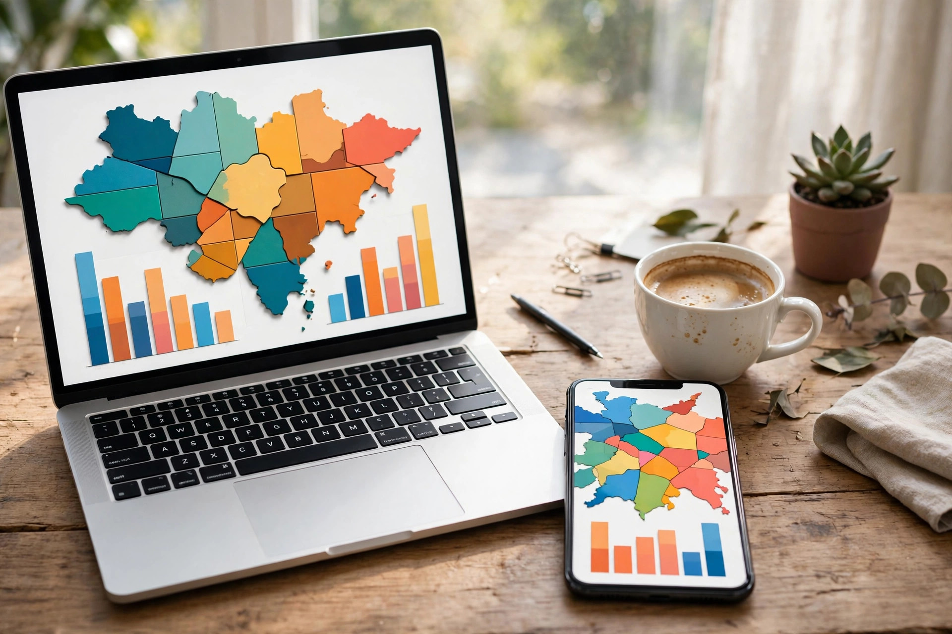
The crowd data is the same everywhere — one system, one set of numbers. But Google shows it to you through four different windows, and each window frames it differently: the Android app, the iPhone app, desktop Maps in a browser, and the knowledge panel in Google Search. People regularly conclude a place “has no busy times” when they were simply looking through the one window that hides the graph deepest.
This article is the comparative tour: where the graph, live bar and labels live on each surface, what each surface does best, and the small traps each one sets. It is the practical companion to our step-by-step on how to see how busy a place is on Google, which teaches the check itself; here we compare the places you perform it.
How do I see busy times on Google Maps Android?
On Android, the listing opens as a card at the bottom of the map. The routine: search or tap the place, then swipe the card upward — this is the step the whole surface hinges on, because the half-open card shows buttons and photos but not the graph. Fully expanded, scroll past the address, hours and action buttons to the Popular Times section, with day tabs along the top and, on today’s graph, the live bar at the current hour.
Android’s strengths are integration. The same listing carries the Directions button, so the crowd check and the route live one thumb apart: read the live bar, then navigate, without switching apps. Saved places and lists are close too — open a favourite from the You tab and its graph is the same two gestures away, which makes the pre-departure check on your regular gym, clinic or supermarket nearly frictionless.
Android’s trap is the un-expanded card: thousands of “no graph” reports are really “never swiped up” reports. If a busy-looking place seems to have no data, swipe first and conclude later.

How can I see how busy a place is on Google Maps?
The iPhone flow rhymes with Android’s — search, open the place sheet, pull it up, scroll to the graph — with two surface quirks of its own. The sheet’s stages are subtler, and a half-hearted pull leaves you in the middle stage, where the graph is still below the fold; a decisive second pull or a scroll inside the sheet gets you there. And because many iPhone users arrive via the Google app rather than Maps, note that the Search panel route (next section) lands on the identical data, sometimes with fewer gestures.
Desktop Maps, in a browser, is the comparison shopper’s surface. The place panel sits at the left, the graph a scroll down it, and the wide screen’s gift is parallelism: open two candidate places in two tabs — two branches of a bank, two hospitals, the mall and the market — and read their days side by side. Weekly planning belongs here too; flipping seven day tabs on a big screen, mouse hovering each bar for its label, is the fastest graph-reading experience any surface offers.
No surface shows different data. Choose by task: phone for the departure check, desktop for the planning session.
How do I see how busy a place is on Google Maps?
Through Google Search, the fourth window, the answer starts in the knowledge panel. Search the place’s name and the panel — right side on desktop, a card on mobile — carries the same Popular Times graph, day selector and live status, often with the live summary promoted near the top. For a one-off check on a borrowed computer or a quick phone search, this is the shortest path of all: no app, no map, one scroll.
Search’s quirks are presentational. The panel is compressed, so deep scrolling hides the graph below reviews and photos more often than in Maps; and category searches (“pharmacies near me”) show a list, in which no graph exists until you open one specific result. Treat Search as the sprinter: unbeatable for checking one named place, clumsy for comparing several — whereupon it hands you to the Maps listing anyway, one tap away.
Whichever window you use, the thing being viewed is identical, because all four are renderings of the same visit data — the aggregated, anonymised patterns Google documents in its Business Profile Help page on popular times, wait times and visit duration.
Why do I have to zoom in on an area to find busyness information?
Because busyness lives at two scales and the map shows one at a time. Zoomed out, Maps is a geography product: cities, highways, district names. The crowd layer — the Busy Area outline over a buzzing district — renders only in the middle zoom band, where a few square kilometres fill the screen and a neighbourhood-sized signal makes sense. Zoom further in and the map becomes a street product of pins and names, where the useful crowd question narrows from “is this district busy?” to “is this place busy?” — answered not on the map at all, but inside the listing’s graph.
So the zoom is not hiding information from you; it is switching the question. District question, middle zoom, area label. Place question, tap the pin, read the graph. Users who zoom to street level looking for the area label, or stay at city level looking for a listing’s bars, are asking one scale’s question through the other scale’s window — the exact confusion our guide to the live busyness layer untangles with the live equivalents of both views. Add the busy area icon on Google Maps, which anchors the area summary at that middle zoom, and the map’s logic is complete: every zoom has its own crowd instrument, and the craft is knowing which one you are holding.
A trap list, surface by surface
Each window has one characteristic way of fooling you, and naming them ends most “the feature is broken” stories before they start. Android’s trap is the un-expanded card described above: buttons and a photo, no graph, and a confident conclusion that the place has no data. iPhone’s trap is the half-pulled sheet — the same listing, the same hidden graph, one gesture short. Desktop’s trap is the wrong panel: a category results page or a neighbourhood page looks like a place page at a glance, and neither carries a graph, because graphs belong to individual listings only.
Search’s trap is the stalest of the four: not in the data, which is live and identical, but in the summary snippets around it — third-party pages and cached descriptions quoting a place’s “usual” hours from months ago. The panel itself is fresh; the folklore around it is not. The universal antidote fits on one line: whatever the surface, navigate to the specific listing, scroll to the graph, read today before any other day. Every trap in this list is a way of stopping one step short of that line.
What never changes, whichever window you choose
Underneath the layouts, four things are constant, and trusting them steadies the whole routine. The data is one pool — aggregated, anonymised visits — so a disagreement between surfaces is always a display issue, never a data dispute. The day tabs always exist; if you cannot find them you are not looking at a listing yet. The live bar only ever lives on today’s graph, at the current hour, on every surface alike — hunting it on a future day’s tab is the one search guaranteed to fail everywhere. And the threshold rule is universal: a small or new place shows nothing on any surface, because the absence is in the data, not the window.
Hold those four constants and the surfaces stop competing. They become what they were designed to be — four doors into the same room, and you simply take whichever door is nearest when the question “how busy is it?” needs its answer.
Which surface should you actually use?
Match surface to moment. Leaving in ten minutes: phone, saved place, live bar — the Android or iPhone app wins on speed and on having navigation attached. Planning the week: desktop, two tabs, seven day-tabs — the browser wins on comparison. Checking one famous place, fast, from anywhere: Google Search’s panel — one search, one scroll, done. Exploring an unfamiliar city’s evening: the app’s middle zoom, hunting Busy Area labels across districts — the discovery view no panel can give you.
Build the habit on whichever surface you touch most, because a crowd check that happens beats a perfect one that does not. The data has been sitting in all four windows for years, identical in each; the only upgrade left is yours — looking through one of them before you leave.
A speed test: the same check on all four surfaces
Put the four windows through one identical task — check the Saturday crowd at a named supermarket, then decide about today — and their personalities sharpen. In the Android or iPhone app, the task is: search, pull the sheet up, scroll to today’s graph, read the live bar. Fastest for the “today” half of the question, with navigation attached for the journey that follows. In Google Search, the task is: one search, open the panel, scroll less far than you feared, and read both the typical Saturday tab and today’s live status in the same panel — the best single-screen summary of the four, provided the place is named and famous enough to earn a full panel.
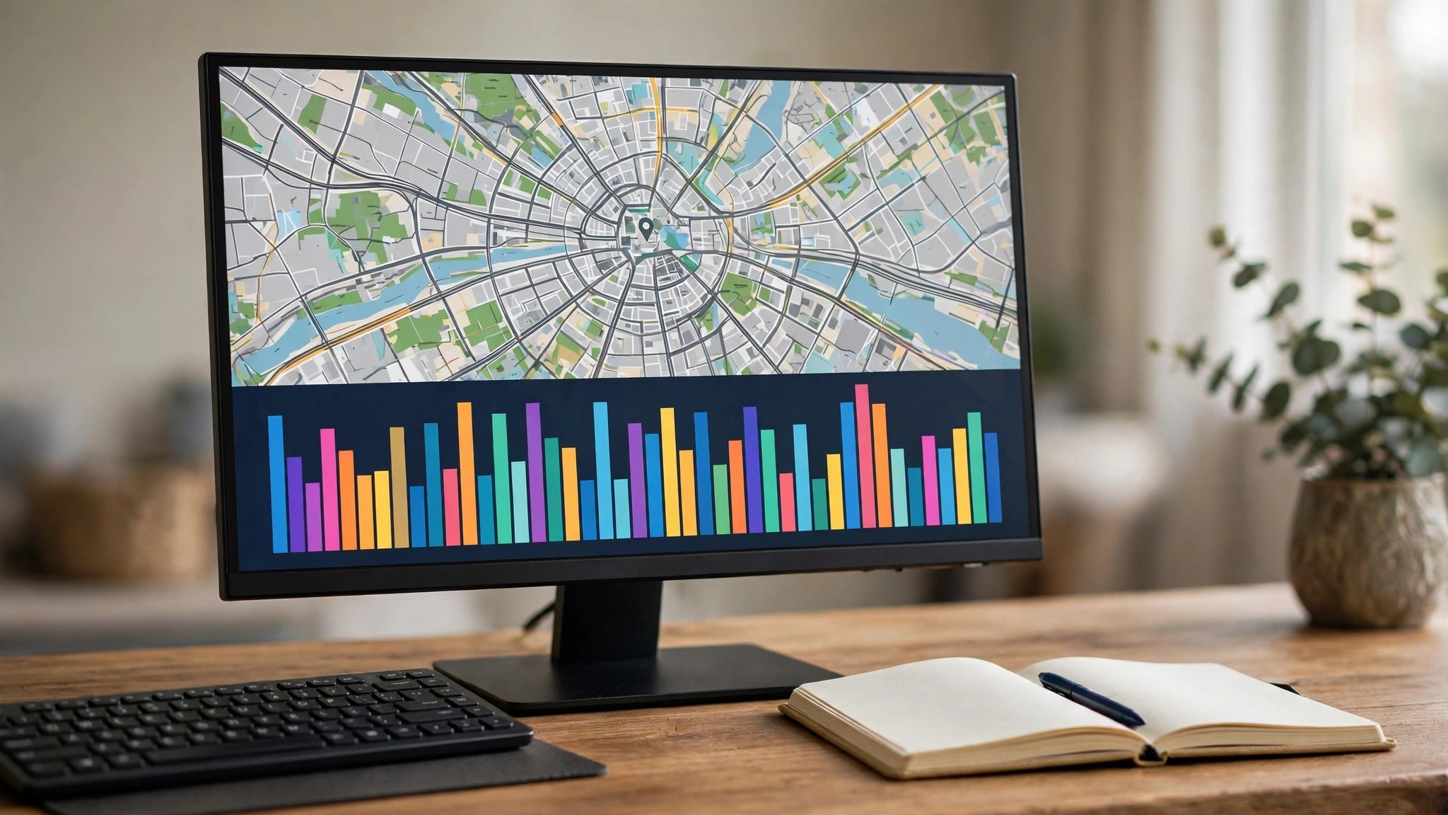
On desktop Maps, the task grows luxurious: the supermarket in one tab, its rival branch in another, both Saturday tabs open side by side, the mouse hovering bars for their word-labels. Slowest to start, fastest to compare — which is why weekly planners migrate here. And the traffic-and-area view inside the app, though not a listing surface at all, completes the task the others cannot: it shows whether the supermarket’s whole district is wearing its Busy Area outline this afternoon, converting a place decision into a trip decision.
The surfaces are not rivals in a benchmark; they are gears in one machine. Search finds, the app checks, the desktop compares, the map contextualises — and the data turning all four gears is the same pool of visits, which is why the machine never contradicts itself.
Frequently asked questions
Is the data different in the app versus desktop?
No. All surfaces render the same underlying visit data; only layout, depth of scroll and comparison convenience differ.
Why does the Search panel sometimes show live status but no graph?
Panel space is compressed; the live summary is promoted and the full graph sits further down the panel or one tap away in the full listing. Scroll, or open the place in Maps.
Can I check busyness from the Maps widget or a smartwatch?
Widgets surface navigation and nearby places, not crowd graphs. The full check needs the listing, in the app, on desktop or in Search.
