
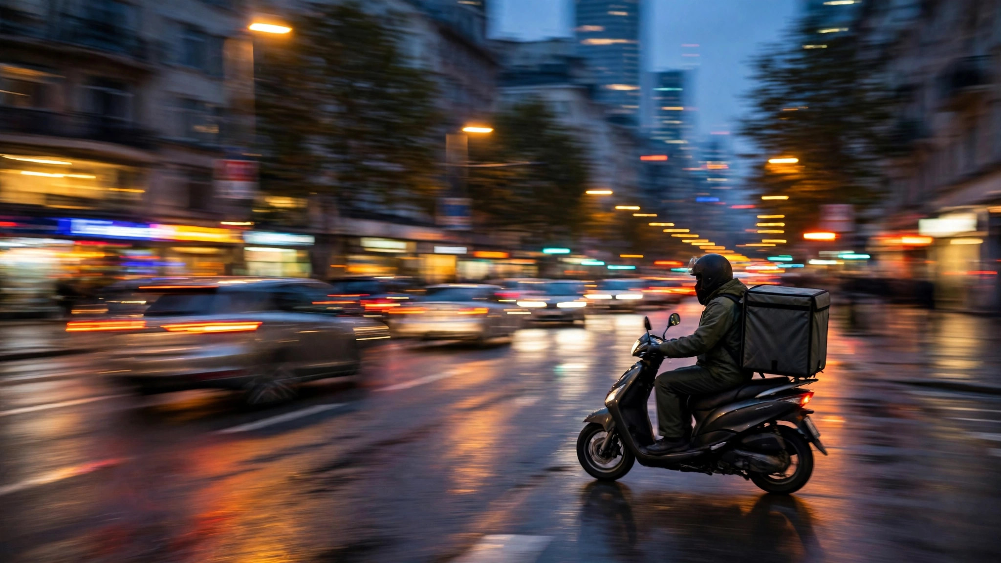
Open the Uber Eats courier app at dinner time and the map changes character: certain zones light up as “busy areas” — the neighbourhoods where orders are flooding in faster than couriers can clear them. Diners never see that map directly, yet they feel it within minutes, as delivery estimates stretch and favourite restaurants flicker between available and unavailable. One signal, two audiences, opposite experiences.
This article explains what a busy area means on Uber Eats — for the couriers who chase it, for the diners who wait through it, and for restaurants deciding when to staff up — and how it relates to (and differs from) the crowd signals on Google Maps that this site usually covers. A note on vocabulary: Uber Eats is a separate platform from Google Maps (its background is summarised in the Uber Eats overview on Wikipedia), and its “busy” describes order demand, not footfall — that distinction runs through everything below.
what does busy area mean on uber eats
On the courier side, a busy area is a zone where order requests are currently outrunning the couriers available to fulfil them. Platforms flag such zones to rebalance the map: couriers are drawn toward the demand — often with earnings incentives attached to trips in or through the zone during the rush — so that orders clear faster and the zone cools. The label is therefore a live operational signal, recalculated as orders and couriers move, and expected to appear and dissolve through the evening exactly as demand does.
Read it as a market price drawn on a map. Where the zone glows, demand is high relative to supply right now. It says nothing about how busy the restaurants’ dining rooms are, nothing about foot traffic on those streets — a rainy Tuesday can produce a fierce busy area over a neighbourhood whose pavements are empty, because everyone is ordering in. Conversely, a festival street packed with diners may show no delivery busy area at all, because its crowds are eating where they stand.
That demand-not-footfall definition is the whole key to reading the label correctly, for both audiences.
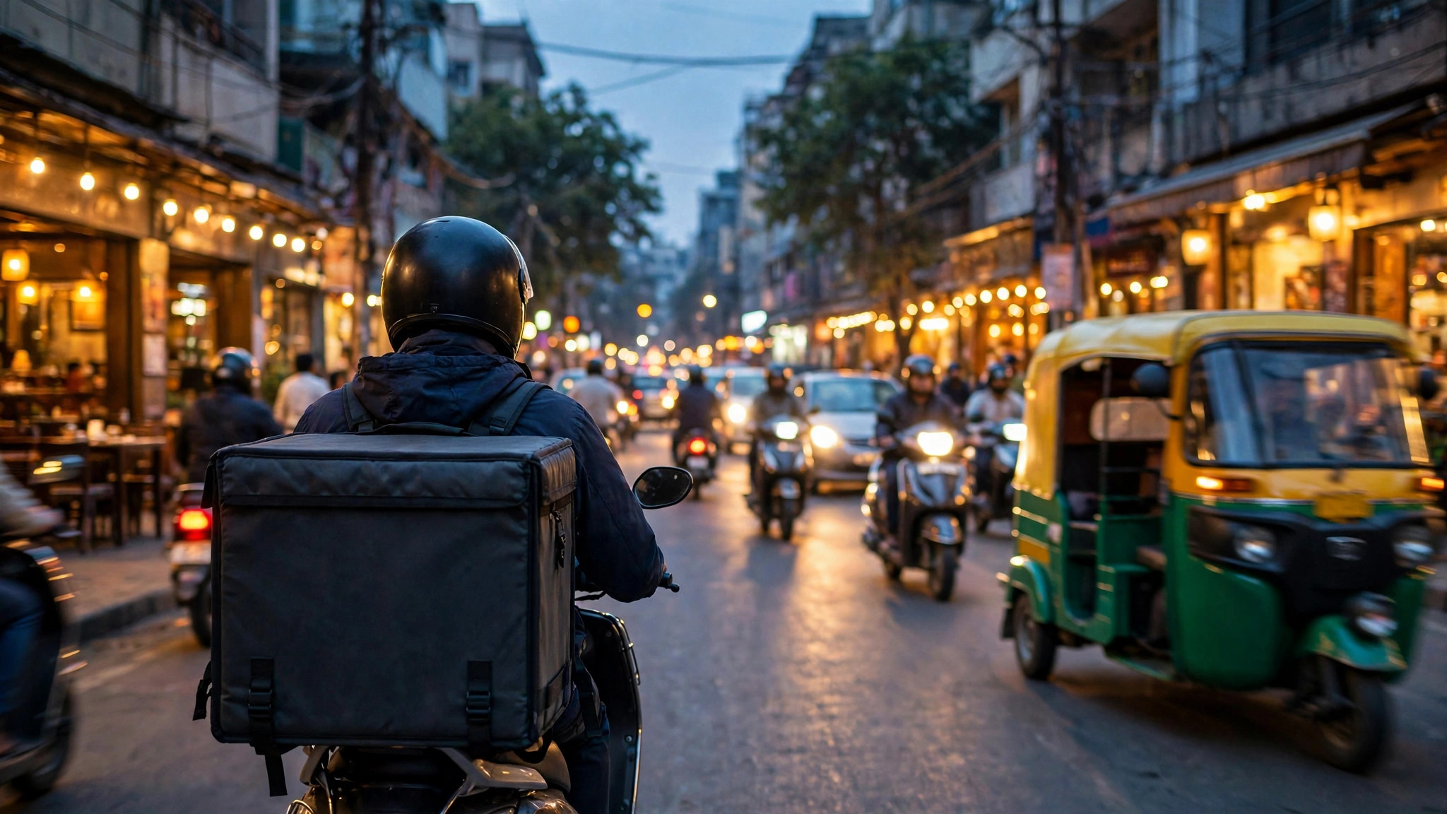
The courier’s view: chasing the glow
For riders and drivers, the busy area is an earnings compass. Its practical grammar:
- Direction, not destination. The signal rewards moving toward unmet demand; experienced couriers angle toward a zone’s edge rather than its centre, positioning for the next order without sitting inside the restaurant cluster where every other courier is also waiting.
- Timing beats geography. Zones ignite at predictable hours — lunch in office districts, dinner everywhere, late-night around student and nightlife quarters, and weekends with a longer, lazier burn. Couriers who learn a city’s weekly rhythm pre-position before the glow appears.
- Weather is the great multiplier. Rain, extreme heat and cold snaps convert eat-out demand into delivery demand within the hour, and busy areas bloom accordingly — the delivery mirror of the way Google Maps’ live bar bends under the same skies.
- The zone cools by succeeding. Every courier it attracts shortens waits and shrinks the imbalance that created it. The label is designed to erase itself, which is why checking it once is a snapshot and watching it is a strategy.
None of this requires the courier to know order counts or thresholds; the map’s summary is enough, which is the point of drawing it.
The diner’s view: what a busy area does to your order
Diners meet the busy area only through its symptoms, so learn to recognise them. Delivery estimates lengthen beyond the restaurant’s normal promise. Fewer couriers nearby can mean orders batching — your food sharing a ride with another drop — or, at peak, a restaurant temporarily pausing new orders to protect its kitchen. In the worst windows, some listings simply show as closed or unavailable until the wave passes, even though the kitchen is open and cooking.
The counter-moves are the classics of any demand peak. Order earlier than the herd: the 7 p.m. order sails; the 8:15 order swims. Order from the near bank of the river: a restaurant on your side of the zone’s centre faces less courier scarcity than one across it. Treat estimates as live data, not insults: when the app says 50–65 minutes during a flagged rush, it is reporting the same imbalance the courier map is glowing about, and the honest number is a kindness compared with a cheerful lie. And when the evening truly matters — guests, a celebration — the busy-area logic argues for the oldest solution of all: book a table, or order hours ahead where scheduled orders are offered, rather than wrestling the peak in real time.
Comparing platforms is fair play too: a zone busy on one app may be calmer on another, because courier pools differ — the demand is shared, the supply is not.
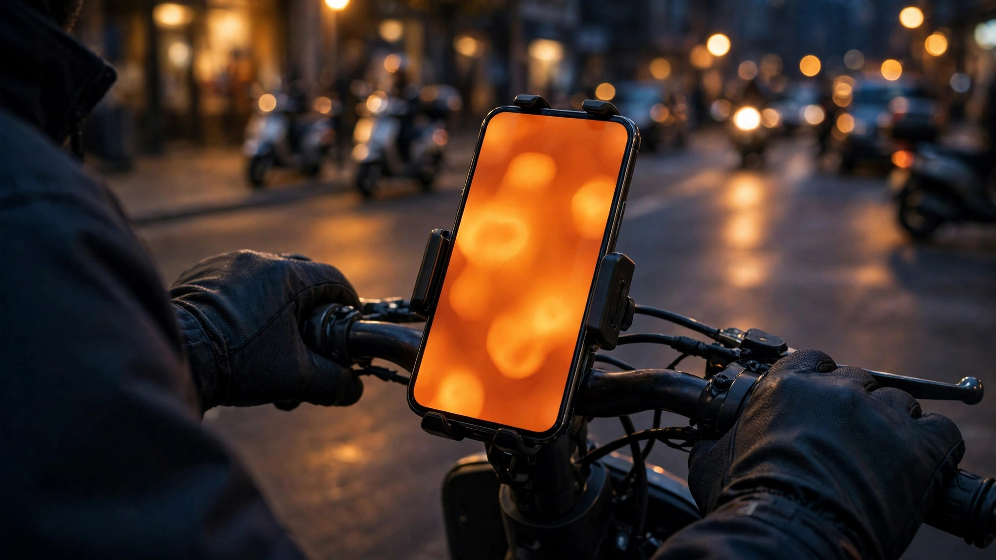
Restaurants inside the glow
For a restaurant, a busy area overhead is mixed news drawn in one colour. Demand is undeniable — the kitchen’s problem is capacity, not customers. The disciplines that separate a profitable rush from a chaotic one are operational: throttle the menu to the dishes that travel and fire fast, staff the packing station like it matters (it is the bottleneck nobody photographs), and pause channels deliberately rather than letting quality collapse publicly in the ratings.
Owners also learn to read the zone’s calendar. A neighbourhood that glows every Friday is a staffing plan; a glow that appears only with rain is a weather protocol; a first-ever glow usually means an event, a closure elsewhere, or a nearby competitor going dark — each worth a different response. In this, restaurateurs and the Google Maps readers of this site are doing the same thing with different instruments: reading their district’s rhythm from aggregated signals, as our guides to busy areas near me and area busyness vs Popular Times teach for footfall. Demand on the pavement and demand on the app are two dials of one city’s appetite.
Busy areas here vs busy areas on Google Maps
Because this site lives on the overlap, let the comparison be explicit. A Google Maps Busy Area aggregates physical presence: many places at their footfall peak, measured from visitors’ phones. An Uber Eats busy area aggregates unmet order demand: requests outrunning couriers, measured from the platform’s own marketplace. They correlate — dinner districts glow on both maps at 8 p.m. — and they diverge exactly when behaviour substitutes one channel for another: the rainy night (delivery busy, streets calm), the festival (streets packed, delivery ordinary), the office lunch hour (both, ferociously).
For anyone whose work touches a city’s evenings — courier, restaurateur, diner, or the merely curious — reading the two together is the complete picture: where the city is eating out, and where it is eating in, hour by hour. Neither platform publishes the other’s data, and neither needs to; the two glows, compared, tell the story. Our pillar guide to the Busy Area feature on Google Maps covers the footfall side in full.
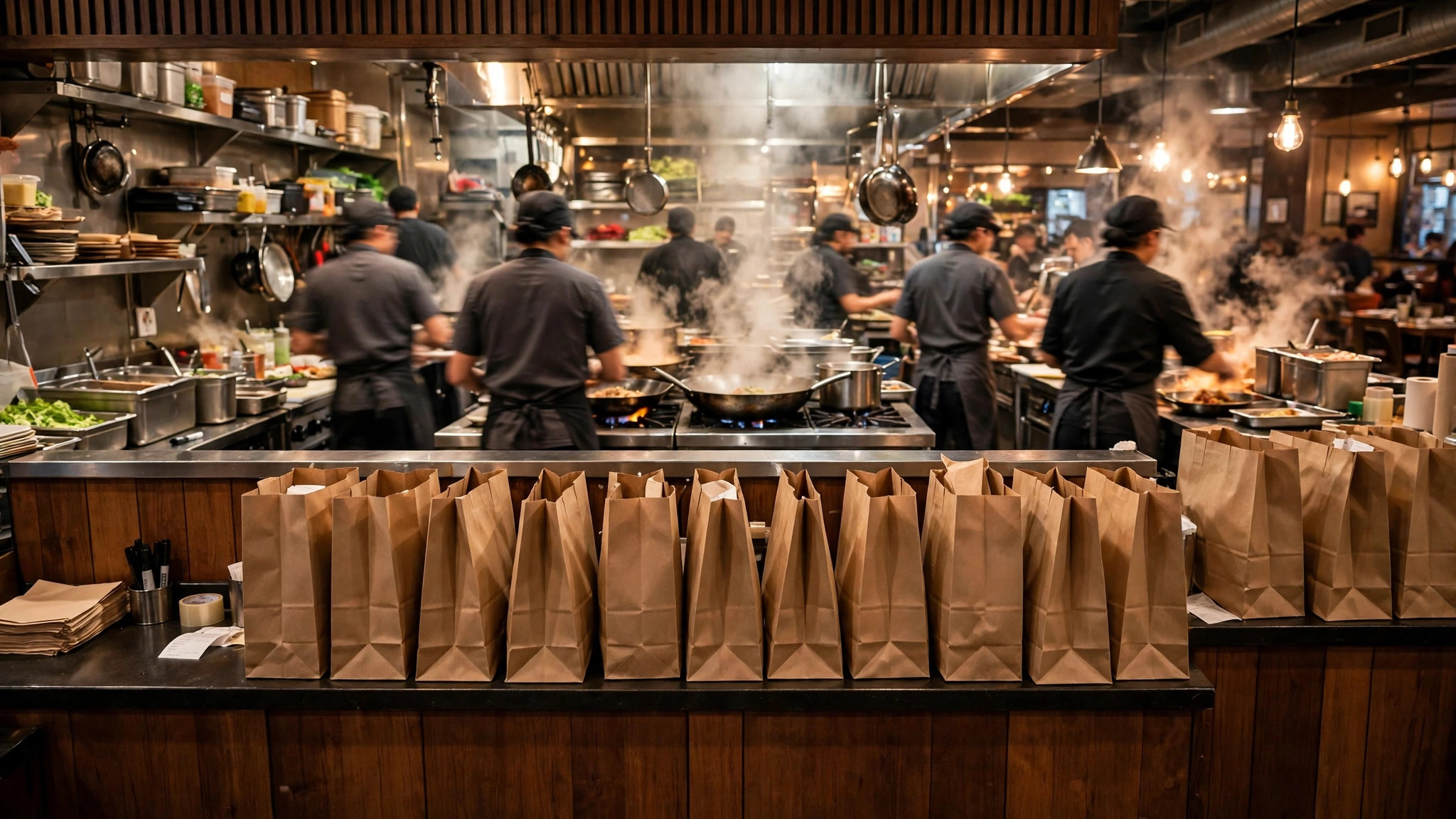
Reading the evening like a courier
You do not need the courier app to borrow the courier’s eyes. A diner’s evening has a demand biography that repeats with liturgical regularity: a first stir around 6:30 as offices empty, the main ignition between 7:30 and 9 when households decide simultaneously, a strange little valley around 9:30 when the first wave is eating and the second has not yet ordered, and a late tail — student quarters, hospital-adjacent eateries, airport zones — that can run past midnight. Rain compresses the whole curve earlier and taller; a big match splits it into a pre-game lull and a half-time spike; festival eves move it to the sweet shops and snack kitchens before the restaurants glow at all.
Order against that biography and the busy area stops happening to you. The 6:45 order rides the first stir with a full courier fleet; the 9:35 order catches the valley with kitchens still hot; the order placed during the ignition peak is the one that teaches patience. None of this requires insider access — only the same pattern-reading this site teaches for pavements, applied to a demand curve that lives in an app instead of on a street.
Three confusions the label causes, cleared
“Busy area” means the restaurants are full. No — it means orders outnumber couriers. A restaurant can be empty of diners and slammed with delivery tickets, or packed at its tables with its delivery tablet silent. Two different rushes share one kitchen, and the label reports only the invisible one.
A busy area means my order will be cancelled. Very rarely the consequence; lengthened estimates and temporary pauses on new orders are the normal pressure valves, and an accepted order inside a busy zone usually completes — later, and possibly batched with a neighbour’s, which is a quality consideration (your fries share a ride) rather than a reliability one. Order the sturdy dishes in the peak and save the delicate ones for the valley.
The zone is drawn around popular restaurants. It is drawn around imbalance, which is demand minus nearby supply — a modest cluster of kitchens with few couriers on a rainy night can glow harder than a famous food street swarming with riders. Popularity is an ingredient, not the recipe; the label stays honest because it measures the gap, not the glamour.

A short history of the glowing map
The busy-area idea migrated to delivery from ride-hailing, where drivers had long been shown demand zones on the map to coax supply toward waiting passengers. Food delivery inherited the pattern and adapted it to a harder problem: an order is not a passenger — it has a kitchen’s preparation time inside it, a freshness window after it, and a diner whose patience is measured in minutes of hunger. That is why the delivery version of the glowing map is less about price theatre and more about logistics triage: pull couriers toward the kitchens that are about to need them, warn the system where estimates must honestly lengthen, and let the zone cool itself by succeeding. Seen that way, the label is not marketing. It is the marketplace thinking out loud — and, for the readers of this site, one more proof that the modern city’s crowds, appetites and movements are all legible to anyone willing to read the right map at the right hour.
Frequently asked questions
Does a busy area mean surge pricing for diners?
The label itself is a courier-side demand signal. What diners experience is its effects — longer estimates, occasional unavailability — rather than the label; any fees shown in the app are presented separately at checkout, so judge the order by its final summary.
Why is my area “busy” when the streets outside are empty?
Because the signal counts orders, not pedestrians. Bad weather is the classic cause: empty streets, slammed delivery network.
Can a restaurant make its area show as busy?
No. The zones are computed from live order and courier balance across the area; a single restaurant cannot create one, though a very popular cluster can contribute to its neighbourhood’s demand.
