

Google Maps rarely shows you a number for crowds. Instead it speaks in phrases: “Usually busy.” “A little busy.” “Live: Busier than usual.” And at the very top of the scale, the one that makes people pause — “As busy as it gets.” These phrases are not decoration; they are a calibrated scale, each rung meaning something precise about a place relative to its own busiest hour.
This article is the phrasebook. It begins with the question people actually type — what does “as busy as it gets” mean on Google Maps? — and then decodes every busyness label and symbol you will meet: the typical labels on the graph, the live labels, the wait and duration phrases, and the area-level wording, so that the next time Maps speaks, you understand exactly what it is claiming. For the chart these labels annotate, our guide to the Popular Times graph is the visual companion.
What are the busy symbols on Google Maps?
Start with the symbols, since they are what the eye catches first. Busyness on Maps is drawn, not numbered:
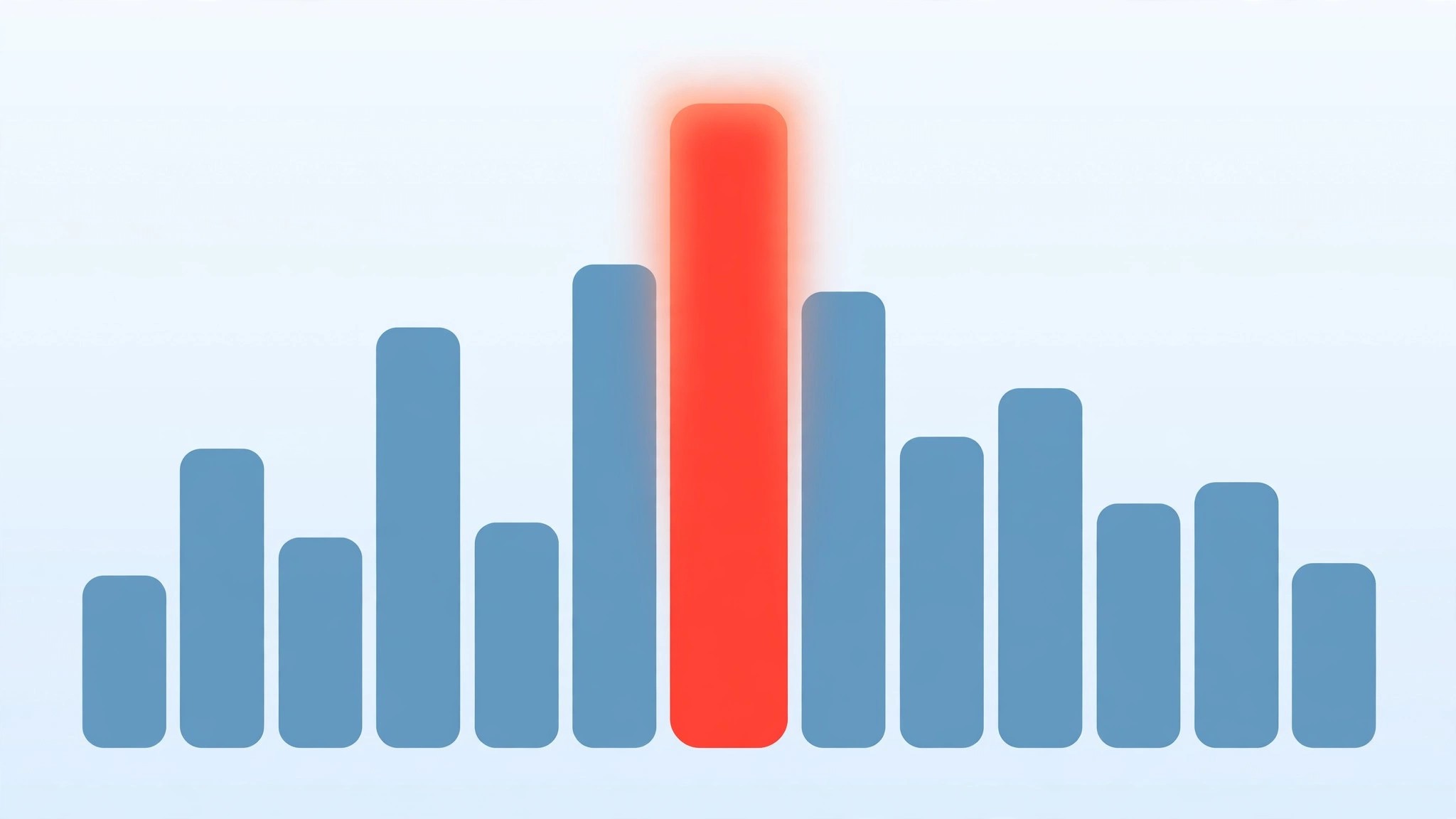
- The bars. The Popular Times graph itself is the primary symbol — bar height is the label, in picture form. A bar at full height is the visual twin of the phrase “as busy as it gets.”
- The live bar. Drawn in a contrasting colour over today’s graph, it symbolises the present moment arguing with the average. Where it outgrows the grey bar behind it, the place is beating its pattern.
- The Busy Area outline and icon. On the map, a soft orange boundary plus the busy-area marker symbolise a district whose places are collectively at peak — the area-level counterpart of a full-height bar, explained in our guide to the busy area label on Google Maps.
- Traffic colours. Green, orange, red and dark red on roads symbolise vehicle speed, not footfall — the one symbol family that is not about crowds of people, and the one most often confused with them.
Every symbol shares one grammar: intensity relative to a local normal. Once you accept that, the words fall into place, because the words are simply the symbols read aloud.
The typical labels: usually not busy to as busy as it gets
Tap any bar on a listing’s graph and Maps grades that hour on a four-rung ladder:
- Usually not busy — the place near its floor. Expect immediate service, empty aisles, your pick of tables.
- Usually a little busy — a gentle flow. Minor waits at a single counter, but nothing that changes a plan.
- Usually busy — a proper, working crowd. Queues form at the obvious pressure points; budget extra minutes.
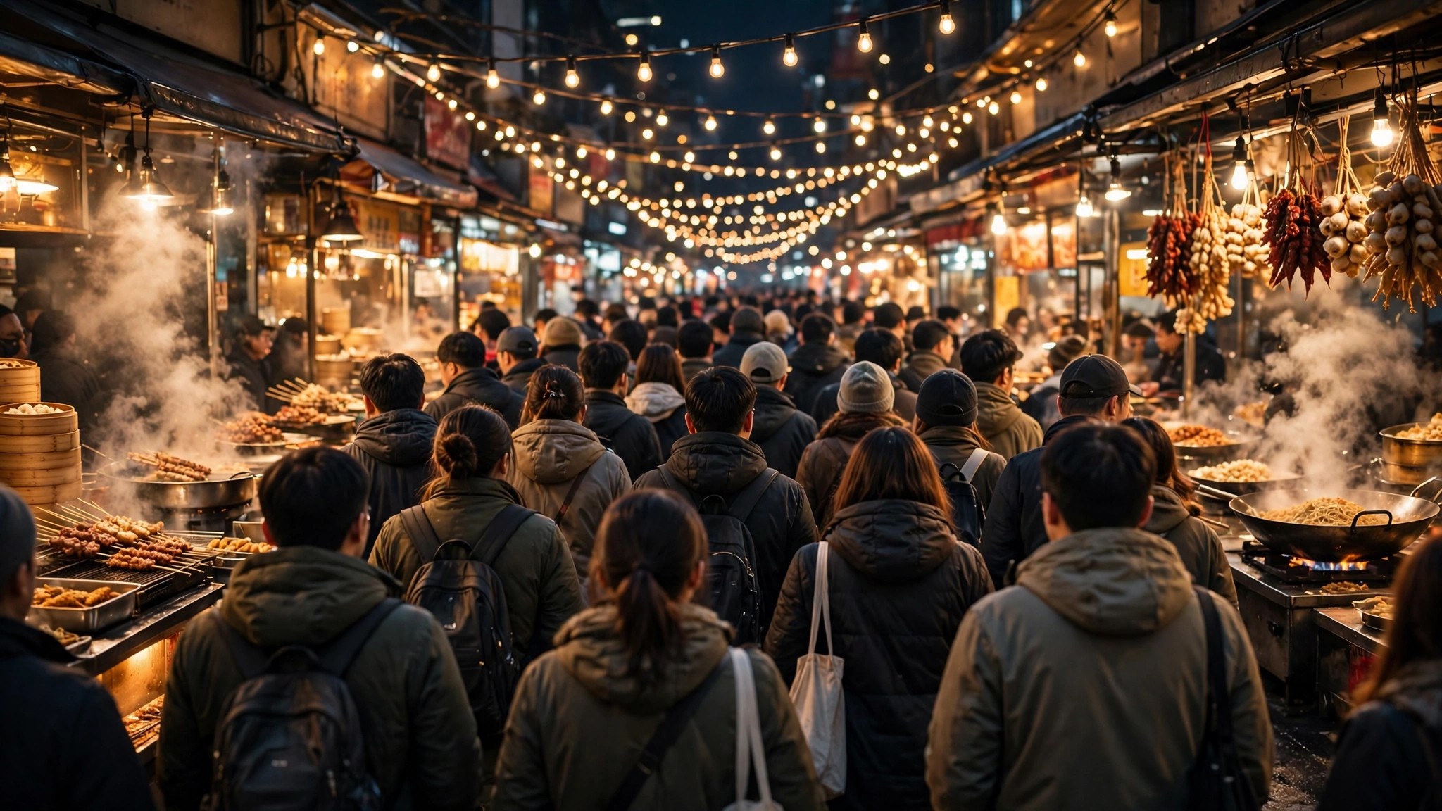
- Usually as busy as it gets — the weekly ceiling for that hour: the place at the fullest it typically ever is.
The ladder is relative to the place, the single most important fact in this phrasebook. “As busy as it gets” at a neighbourhood bakery might mean a dozen customers and a five-minute queue for bread. The same phrase at a metro terminus means a surging platform. The label promises a position on that place’s own scale — the top — and keeps that promise honestly at both sizes. Comparing labels between different places is the classic beginner’s error; comparing them within one place, across hours and days, is the expert move the system was built for.
How does Google know “as busy as it gets”?
The ceiling phrase is earned statistically. Google aggregates months of anonymised visit data for a place (the pipeline is described in our explainer on how Google knows how busy a place is, and in Google’s own Business Profile Help documentation). The busiest recurring hour in that data defines the top of the scale — the height every other bar is measured against. An hour earns “as busy as it gets” when its typical level sits at, or essentially at, that ceiling.
Two subtleties follow. First, the ceiling is a typical peak, not the wildest day ever recorded: a one-off festival stampede does not reset the scale, because the averages smooth it away. The phrase means “as busy as it typically gets,” and the omitted word matters. Second, the ceiling can move. If a place’s evenings genuinely grow over a season — a restaurant district finding fame — the top of the scale recalibrates upward, and yesterday’s full-height bar becomes today’s “usually busy.” The labels describe a living pattern, not a fixed verdict.
The live labels: busier than usual, and its siblings
Layered over the typical ladder, the live labels compare now against usually, and their wording is comparative for a reason:
- Live: Less busy than usual — today is underperforming its pattern. The connoisseur’s signal: the famous place, on a quiet day, at a good hour.
- Live: Usually busy (and its rungs) — reality is tracking the typical label for this hour; trust the graph as written.
- Live: Busier than usual — today is beating the pattern. Something local is happening, and the typical graph has temporarily stopped describing your trip.
- Live: As busy as it gets — the rare top label: the live crowd has reached the place’s typical ceiling, live. Treat it as the strongest crowd warning Maps issues for a single place.
Notice the asymmetry: the live scale can report a crowd above the typical pattern’s mid-rungs but the vocabulary caps at the ceiling phrase — Maps will tell you a place is at its usual maximum, and leaves the rest to your imagination and the queue in front of you.
busy area meaning
At district level the phrasebook shrinks to one entry: the Busy Area label, sometimes accompanied by area wording like “Busy area” in the summary panel naming the district and its busiest places. Its meaning, precisely, is that many places in this small area are simultaneously at or near their busiest — the four-rung ladder, applied to a neighbourhood all at once.
The area label has no “a little busy area” rung; it is binary by design, appearing only at the top of the collective scale and vanishing below it. That is why it feels abrupt compared with the listing labels’ gentle gradations — different tool, different grammar. Our pillar guide to the Busy Area feature on Google Maps covers the area system’s behaviour across a full day, including when to expect the label over your own district.
Wait times and visit duration: the supporting phrases
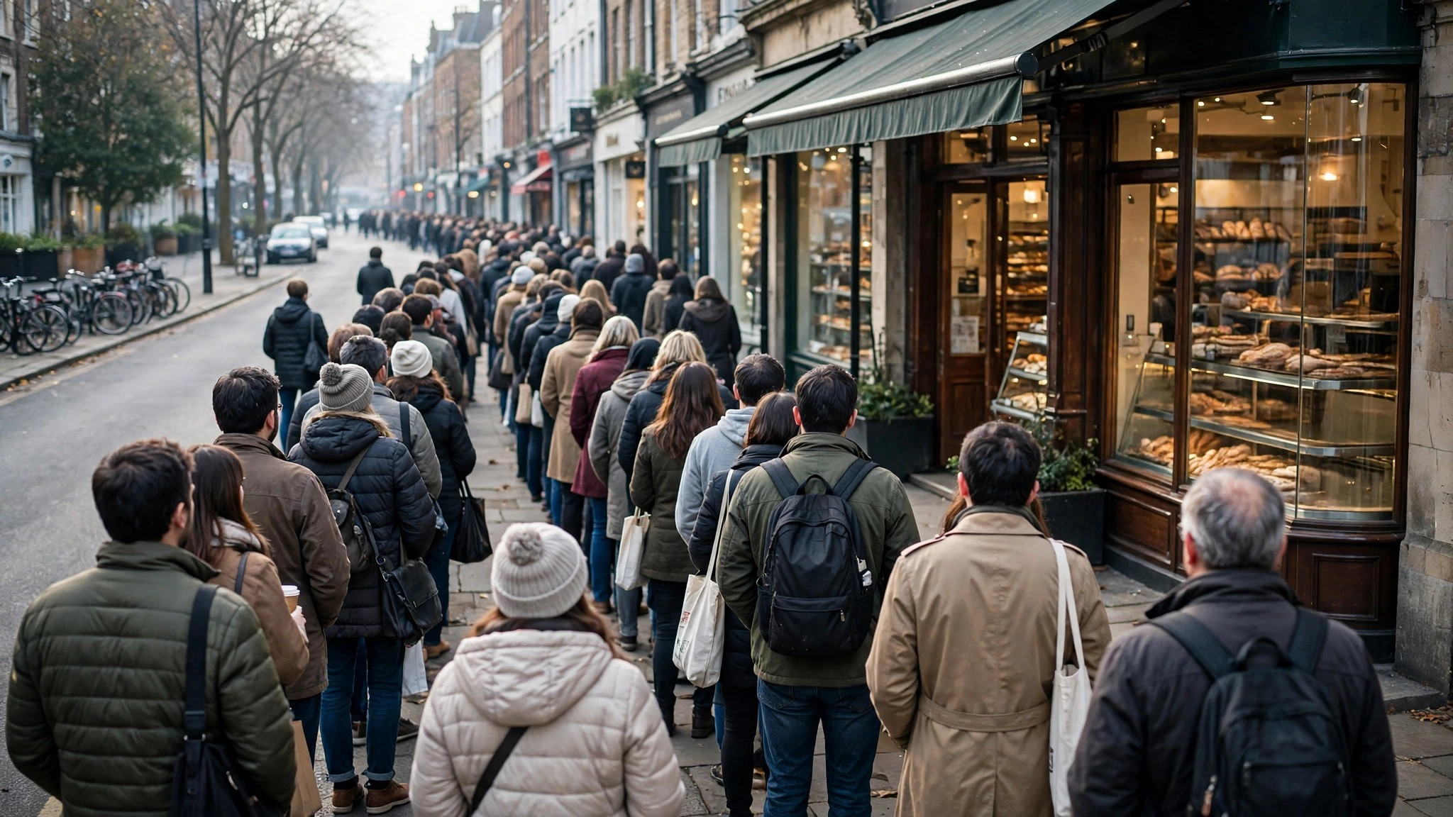
Two more phrase families complete the listing’s vocabulary. Wait-time phrases — “People usually spend…” is duration; the wait line at restaurants reads as an estimate per hour with the day’s peak wait highlighted — translate crowd into minutes, which is often the number you actually needed. A place can be “as busy as it gets” with a short wait (many counters, fast service) or merely “usually busy” with a punishing one (a single token window), so read crowd and wait as separate dials.
Visit-duration phrases — “People typically spend 45 min to 1.5 hr here” — describe dwell, not crowd at all. They belong in trip budgeting: a “usually not busy” attraction where people typically spend three hours is a bigger commitment than a packed café where people spend twenty minutes. The complete listing, read fluently, is a small paragraph in this phrasebook’s language: how full, how long a wait, how long a stay. Learn the phrases once and every listing in the country starts speaking clearly.
Putting the phrasebook to work: three readings
A hospital listing, Tuesday, 10 a.m. bar selected: “Usually as busy as it gets.” Translation: this is the OPD’s weekly mountain — token queues at their longest. The phrasebook’s advice is mechanical: any other weekday hour outranks this one, and the 8 a.m. bar’s “usually a little busy” is the appointment to ask for.
Your regular café, live label showing “Live: Less busy than usual” at 6 p.m.: Translation: the evening rush has failed to materialise today. Whatever the graph’s typical 6 p.m. bar says, the room is calmer than its habit — go, and take the good table by the window.
A mall district at 1 p.m. on a festival Saturday, map showing the Busy Area outline, anchor store at “Live: As busy as it gets”: Translation: district and destination are peaking together. Expect peak parking pain, peak till queues and peak food-court waits; the phrasebook’s combined reading says either commit fully to the expedition or move it to the festival’s second morning, when the same labels will read two rungs lower.
Fluency is nothing more than this: hearing each phrase as a position on a scale you understand, relative to a normal you have learned. Three readings like these, on places you know, will teach the language faster than any table of definitions.

Misreadings to avoid
Three misunderstandings follow these labels around, and each produces a small, avoidable mistake. The first is comparing labels across places: abandoning a “usually busy” neighbourhood bakery for an “only a little busy” wholesale market, then meeting a far larger crowd at the second — the labels were each honest about their own place, and meaningless about each other’s.
The second is reading “usually” as “will be”: the typical labels describe an average week, and treating them as today’s forecast throws away the live label, which exists precisely to correct them. When the two disagree, the live label is describing the day you are actually in.
The third is fearing the top rung: “as busy as it gets” sounds like a warning siren, but at a well-run place — many counters, timed entry, a big floor — the ceiling crowd is simply the place at full, happy capacity, and regulars often prefer its energy. The phrasebook gives you the fact; your errand decides whether it is a warning or an invitation.
Frequently asked questions
Is “as busy as it gets” the same at every place?
No — it is the top of each place’s own scale. It guarantees a peak-level crowd for that place, which may be twelve people or twelve thousand.
Can a place be “busier than usual” and still quiet?
Yes. The live labels are comparisons: a normally silent library at double its usual footfall is “busier than usual” while remaining, in absolute terms, a calm room with a few extra readers.
Why does one hour say “usually busy” and the next “as busy as it gets”?
Because the typical data crosses the ceiling band between those hours — the peak hour of the day has arrived. That one-step jump is the graph telling you exactly when the rush lands.
Do the labels differ by country or language?
The scale is the same everywhere; only the wording is translated. A listing read in another language during a trip abroad is grading its hours on the identical four rungs, so your phrasebook travels with you.
Can a business change its label?
No. Labels are computed from visit data; owners cannot edit, soften or remove them. A place earns gentler labels only the slow way — by genuinely being calmer at that hour.
Learn the four rungs, the live comparisons and the one binary area label, and the map stops mumbling. Every phrase it uses is a precise claim about a crowd relative to its own normal — and now you can hold it to that claim, hour by hour, place by place.
