
Of the three statistics on a busy listing, visit duration is the one people read least and need most. The crowd graph tells you when a place fills; the wait time tells you what the queue costs; but the quiet line reading “People typically spend 1 to 2 hours here” tells you how much of your day the visit will consume — and misjudging that number is how a “quick trip” eats an afternoon.
This short, practical guide answers the question — what is visit duration on Google Maps? — and explains how Google calculates it, why it appears as a range, and how to build it into real itineraries: museum days, hospital visits, market runs, family outings. It completes the visit-data trio alongside our guides to Google Maps wait times and the crowd graph itself.
What is visit duration on Google Maps?
Visit duration is the typical length of a visit to a place, estimated from real visits and shown as a range: “People typically spend 25 min to 1 hr here,” or “2 to 4 hours,” depending on the kind of place. You will find it in the listing near the Popular Times graph, when it appears at all.
Three clarifications prevent the common misreadings:
- It measures time at the place — from arrival to departure — not time in a queue specifically, and not the length of any single activity inside.
- It is a typical range across many visitors, not a recommendation: a museum where people typically spend three hours is not telling you to spend three hours; it is reporting what crowds actually do.
- It is category-flavoured: the same words mean a long lunch at a restaurant, a full film plus trailers at a cinema, an OPD consultation plus pharmacy at a hospital.
Read it as the crowd’s diary rather than the place’s promise, and it becomes one of the most honest planning numbers on the internet.
How does Google know how long people typically stay at a location?
The same way it knows everything in this feature family: from the visits themselves. Google documents that visit duration estimates are based on patterns of customer visits over the last several weeks, drawn from aggregated, anonymised data from users who opted in to Location History — the pipeline detailed in its Business Profile Help page on popular times, wait times and visit duration, and traced end-to-end in our article on where Google’s busy data comes from.
Mechanically, a visit has a beginning (a device arriving within the place’s footprint) and an end (that device leaving it), and the interval between the two is a dwell time. Pool thousands of dwell times for a place, discard the nonsense at the edges — the two-minute pass-through that was never a visit, the phone left overnight that was never a customer — and the honest middle that remains is the typical visit, expressed as a range because human behaviour comes in ranges.
That edge-trimming is why the figure is trustworthy at scale and why it needs volume: a place must receive enough measured visits before any duration is published, under the same threshold rule that governs the whole family. Where data is thin, the line simply does not appear — the system’s consistent preference for silence over a shaky number.
Why a range, and how to read the ends of it
Google shows a band rather than a single number because visits genuinely bifurcate. A café’s “45 min to 2 hr” conceals two tribes: the espresso-and-exit crowd at the short end, and the laptop settlers at the long end. A supermarket’s range separates the top-up shopper from the monthly-stock-up family. The range is the honest summary of a split population.
Reading it well means placing yourself in the distribution. Ask which tribe you belong to on this trip: Are you the quick visitor (a single errand, one department, a takeaway) or the full visitor (the whole exhibition, the complete darshan circuit, the unhurried lunch)? Budget by your end of the range, then add the wait time at your arrival hour and the travel each way — the full arithmetic this series recommends — and the listing has quietly planned your outing to within fifteen minutes.
The range also exposes a place’s character at a glance. A narrow range means a regimented experience: cinemas, clinics with fixed slots, guided attractions. A wide range means a place that bends to its visitors — markets, museums, malls — where your own discipline, not the venue, decides when you leave.

Budgeting real trips with visit duration
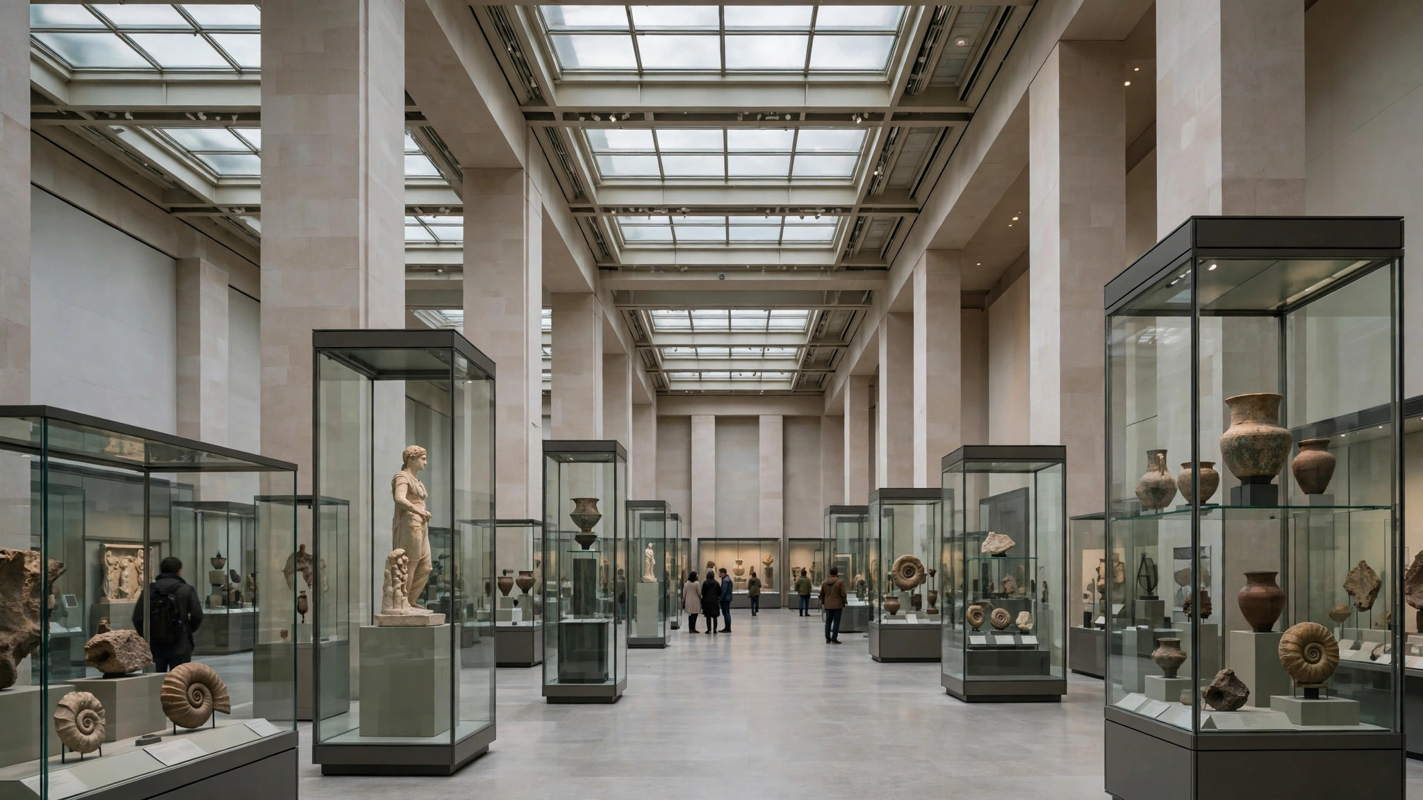
The museum day. Duration 2.5–4 hours, Saturday peak from 11 a.m. Translation: arrive at opening to beat the crowd, and protect the whole late morning; a “quick look” at this museum is a fiction the data politely corrects.
The hospital visit. Duration often reads 1–3 hours for large hospitals — consultation, tests and pharmacy pooled. Combined with the graph’s mid-morning peak, it explains why OPD days feel endless and why an early token is worth more than any shortcut inside.
The weekly shop. A hypermarket’s 45–90 minutes, plus the graph’s Saturday plateau, plus a long checkout at peak: the data makes the case for the Tuesday-evening slot more persuasively than any family argument could.
The pilgrimage or famous attraction. Durations at major temples and landmarks include darshan queues and the full circuit; on festival days, treat the top of the range as the floor of your plan, and let the live bar — from our pillar guide to the Busy Area feature on Google Maps — warn you if even that is optimistic.
In each case the pattern is the same: duration converts a place from a point on the map into a block in your day, and blocks — unlike points — can be scheduled around.
Visit duration by category: a field guide
The figure means different things in different uniforms, and category fluency makes it twice as useful. Restaurants: duration tracks the format — counters and thalis at the short end, family dining in the middle, fine dining and buffet houses at the long end; a sudden widening of a favourite’s range often means it has added a lingering element (a dessert counter, a lounge) before any review mentions it. Retail: supermarkets split by basket size, while malls report the whole expedition — parking to food court — which is why mall durations look enormous beside the shops inside them.
Healthcare: hospitals pool consultation, diagnostics and pharmacy into one dwell, so their durations read like total journey times and should be budgeted as such; diagnostic centres, by contrast, are sprint venues whose short durations make them schedulable between other errands. Attractions and worship: museums and zoos show wide ranges because visitors self-pace, while temples show a deceptive calm — a modest typical duration that festival days multiply beyond recognition, which is exactly when the live crowd signals must overrule it. Transit and services: stations show short durations (they are pass-through machines) while salons, spas and clinics show appointment-length blocks that behave like reservations whether or not you booked one.
Learn your five regular categories’ normal bands and any listing’s number starts speaking in sentences: above band means an event or a change, below band means a format shift — either way, the place is telling you news.

The duration trap: when the typical visit misleads
Three situations bend the statistic away from your experience, and each has a tell. The split crowd: where two very different visits share one listing — a hospital’s five-minute pharmacy pickup and its three-hour OPD saga — the published range averages tribes you do not belong to; your own tribe’s end of the range, or the reviews’ anecdotes, will serve you better. The dated pattern: because the estimate rolls over recent weeks, a place mid-transformation — a market half-closed for renovation, a museum with its star gallery shut — may publish the ghost of its old visits; recent reviews expose the gap instantly.
The event distortion in reverse: a place famous for one annual blowout — a book fair venue, an exhibition ground — carries ordinary durations all year that say nothing about fair week, when the live bar and the area label become the only honest instruments on the page. The trap is never the number itself; it is forgetting the number’s tense. Visit duration is written in the recent past, about typical strangers. Your trip happens in the future, as a specific person — and the small act of adjusting the one into the other is the whole craft this statistic asks of you.
When the line is missing, and what to use instead
No duration line means the usual thing: not enough measured visits yet, or a place whose visits are too erratic to summarise. Substitutes are close at hand. Reviews betray duration constantly (“we spent the whole afternoon,” “in and out in twenty minutes”) if you scan for time-words. The category gives a prior: sit-down restaurants run longer than counters, museums longer than galleries, hypermarkets longer than convenience stores. And your own history is data too — the second visit to any place, you are your own statistic.
What you should not do is treat the missing line as a missing cost. Every visit spends time; the only question is whether you budgeted it from data or discovered it in the queue.

Duration and the remote-work café problem
One modern tribe deserves its own note, because it bends this statistic daily: the laptop visitors. A café whose typical duration reads “1.5 to 3 hr” has been colonised by remote workers, and that number is now a seating forecast — it tells the next laptop carrier that tables turn slowly and the good sockets are occupied for hours, while telling the owner that her morning rush is a occupancy problem, not a footfall one. Cafés respond with the tools the statistic makes visible: minimum spends at peak, laptop-free hours, seating zones — each an attempt to edit a duration figure they cannot edit directly, since Google publishes it from behaviour alone.
For visitors the lesson generalises. Duration is not just your budget line; it is a description of everyone else’s behaviour competing for the same space. A short-duration place forgives a crowd — the queue moves because the visits end. A long-duration place amplifies one. When you read the line from now on, read it both ways: how long you will stay, and how long they will.
Frequently asked questions
Does visit duration include the queue to get in?
It measures the whole visit from arrival to departure, so time spent queueing inside the visit is part of the dwell the estimate reflects — one more reason to pair it with the separate wait-time figure where one is shown.
Why did a place’s duration change since I last looked?
The estimate rolls forward from recent weeks of visits. Seasonal behaviour — longer summer museum visits, longer festival-season market trips — genuinely moves it.
Is the duration for a place like mine shown to its owner?
The owner sees the same public line you do. There is no private dashboard of visit records behind it.
